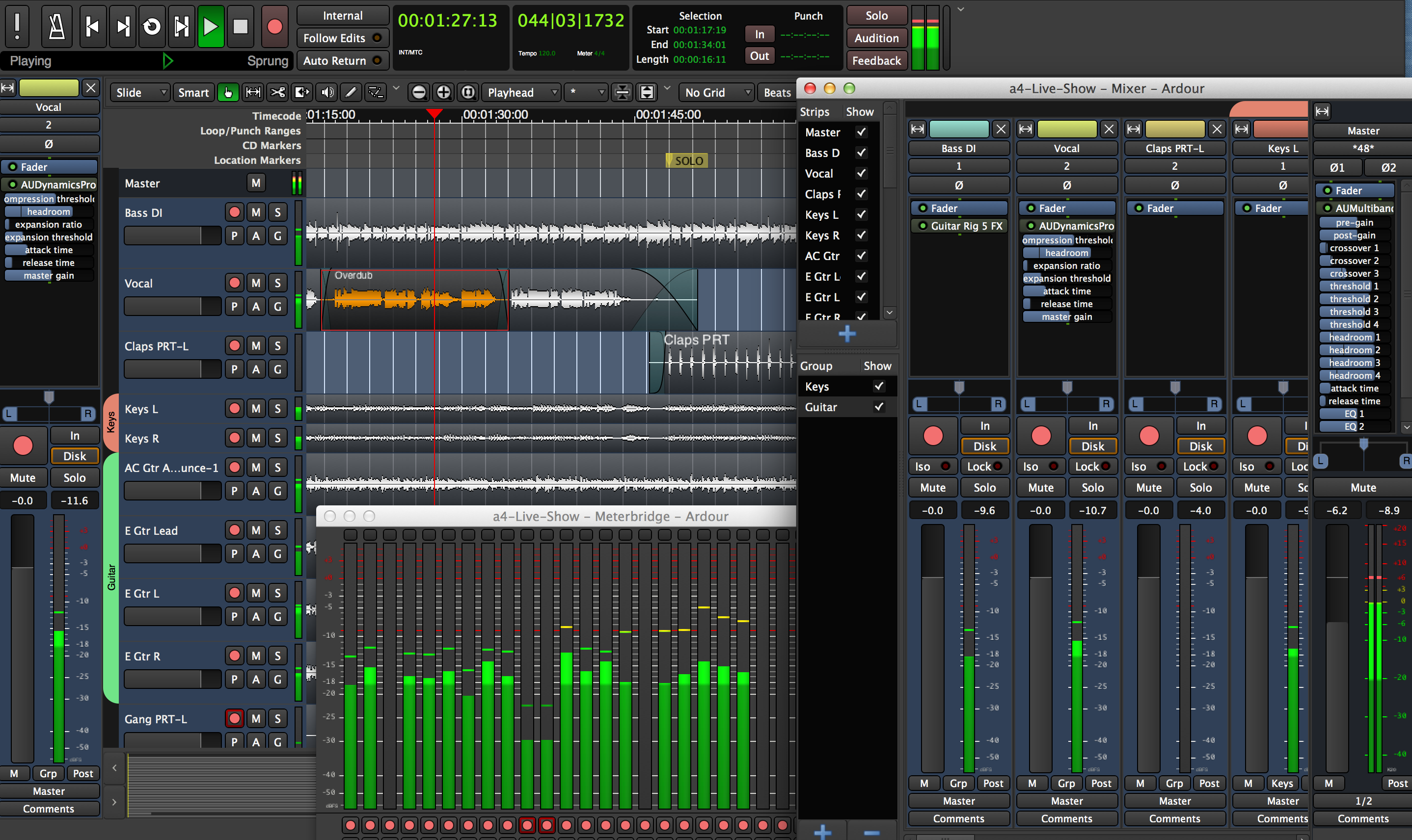
What's your problem with GTK? I mean I like good UIs and this is what attracts me. So Ardour has a good looking UI (IMHO). How does the window toolkit impact you?
> I mean I like good UIs and this is what attracts me.
Hard disagree. DAWs like Logic, Ableton, and Bitwig have consistent, straightforward, and (given the amount of data) relatively uncluttered UIs. The open source or cheaper DAWs, like Ardour and Reaper, are a veritable explosion of inconsistent and different sized widgets, fonts, and styles. Reaper also apparently likes massive walls of random text for its menu system too. This is only too typical of open source software: there's no UI designer who can rein in the chaos.
You don't know that we (Ardour) have no UI designer, you just don't like the result of whatever design process we use. You also don't seem to have considered that there are lots of Reaper users who actually love it's user interface, including those massive walls of text in its menus.
It's fine to say "I don't like (Ardour|Reaper)'s GUI, but I do like Logic, Ableton and Bitwig". There's not much point trying to go beyond that. I get email from about 1 person a week, with about a 50/50 chance of either "I used Logic/other-DAW for years, but Ardour is so much better looking and easier to use" or "Ardour is a piece of shit and ugly as hell, nobody can use this crap". Which is pretty great hint that large swathes of DAW UI/UX design remains extremely subjective and path dependent.
> You don't know that we (Ardour) have no UI designer, you just don't like the result of whatever design process we use.
So do you have a professional UI designer or not, and who is he?
I think UI design is all about being consistent across modes, being tolerant, making common things easy to do and easy to discover while still making the less common things possible. I think it's a pretty well understood field at this point. I do not think it's about prettiness or visual consistency, but visual consistency is certainly a signal that tells us that the other elements in the UI design may be lacking a designer's touch. So let's look at that.
I count no less than eight different fonts and font sizes on this screen. Use of whitespace throughout is terrible: for example, look at the placement of the red light snugged up right next to the "Lock" button rather than the Iso button. Speaking which, I presume Iso means "Isolate" while "Grp" means, well, let's assume it doesn't refer to the Grp A4 Synthesizer. Why do you shorten in some ways by removing vowels, and in others by brute truncation?
You also have literally dozens of different button heights. Consider just your faders. Put aside the giant red button. The R/L pans are 32 pixels tall. The In button is 38 pixels tall. The Lock button is 36 pixels tall. The Solo button is 42 pixels tall. The buttons at the bottom are 32 pixels tall. For no reason at all it seems.
You also seem to have tons of different widget widths. Let's consider the VU meters. The Meterbridge meters are 28 pixels wide: the Mixer meters are 24 pixels wide, and its stereo channels are 14 pixels wide (and with completely different dB markings as well) The per-instrument meters at the far left are 16 pixels wide The stereo meters above them are for some reason 10 pixels wide, and together they're 22 pixels wide and so don't line up with the mono meters below them. And finally the global stereo meters up top are 28 pixels wide. What?...
Text styling, justification and clipping is just kooky. Look above the second fader. Vocal, 2, and 0 (which looks like the null set, not a zero, due to weird width) are all centered. Then Fader and AuDynamicsPro are left-justified (And AuDynamicsPro is cut off because it's not getting resized). THEN all the parameters underneath (compression threshold -- again cut off in an ugly way, headroom, expansion ratio, etc.) are all centered again. And they are for no good reason lower-case only. So you have both capitalized case, lower-case-only, and upper-case-only strewn throughout your layout.
To the left of the fader you have "Strips" and "Show". The Show checkboxes are almost invisible thanks to the dark-charcoal-on-black color scheme. Also thanks to your nearly invisible charcoal-on-charcoal scrollbar, you can't read the strips. What's "Claps F"? Why is the "+" so gigantic,and why is it gradiated when no other icons are? I presume the divider can be expanded, but again it's nearly impossible to tell due the charcoal-on-charcoal.
Why are your In, Out, Solo, Audition, and Feedback buttons different colors from the other ones? Why are some of your icons antialised, but others (like the thing to the left of the scissors, or the thing to the left of "No Grid") not? Why are the console buttons (play/record/etc.) smashed together horizontally into thin strips, rather than giving them the standard width afforded to buttons of this importance? At least you could make them square to match their icons. Why is your Tempo and Meter in an incomprehensibly small font? Why do you have two different green colors for fonts?
I am not a big fan of Ableton (say). But its interface is more consistent, much less busy, and much more approachable than Ardour. This is the hallmark of open source software: it tends to lack a hegemon who will sit down and (1) remove features to simplify the interface and (2) force a consistency in design and modality on the software. I will say that what I don't like about Ableton is that it tends to have a lot of mystery-meat interface widgets which don't explain their purpose. But at least they're consistent. :-)
Now Ardour is FAR better than the interface nightmare that is Reaper, a veritable explosion of every single interface style, coupled with a seeming lack of understanding regarding how menus work best. Reaper's interface is objectively bad, full stop. Now there might be people who love it, but I'd wager that's primarily because those people have ego investiture in the product, and ego investiture comes with blinkers. We get heavily involved or invested in a product and it becomes our identity. This should never be an excuse for making a poor product. And compared to practically everyone else out there, Reaper's interface is really, really bad.
There's some valid criticism here, which I'll put in our issue tracker.
However, you could have started with a screenshot of something current instead of 7 years old. Several if not many of the issues you've mentioned have already been addressed.
The problem with the UI/UX paradigm of "making common things easy to do and easy to discover while still making the less common things possible." in the context of a DAW is that what's common and less common depends a lot on workflow.
Specific details;
> Why are your In, Out, Solo, Audition, and Feedback buttons different colors from the other ones?
In, Out and several other buttons are tri-state, not bi-state, to indicate, for example "muted because you soloed something else" rather than "not muted" and "muted because you muted it". The Solo/Audition/Feedback buttons are global indicators that also function as buttons.
> You also have literally dozens of different button heights.
Vertical space is at a premium in a mixer-style layout, so many buttons are sized to fit their contents rather than have consistent sizing. And in general, we eschew "all buttons should be the same size" anyway, because we want to prioritize some and deprioritize others.
Ableton is much less busy, but also presents way, way less functionality in their mixer (compared to Ardour's, or a large scale mixing console, it's almost a toy). You can certainly argue that it offers the right level of functionality for most people, and that busying it up is a negative for most users. I'm not even sure I'd disagree with you, but we've tried to build software for the sorts of people who are comfortable with large scale mixing consoles (or would be, if they could afford one), rather than bedroom producers who get just what they need and not much more.
> Why do you shorten in some ways by removing vowels, and in others by brute truncation?
22yrs of user feedback, mostly.
> And compared to practically everyone else out there, Reaper's interface is really, really bad.
Although your explanation of why this might be could have some truth, the sheer number of people who love Reaper's interface really argues against the claim that there's some sort of "objectively bad" here.
> Then Fader and AuDynamicsPro are left-justified (And AuDynamicsPro is cut off because it's not getting resized). THEN all the parameters underneath (compression threshold -- again cut off in an ugly way, headroom, expansion ratio, etc.) are all centered again.
"Fader" and "AuDynamicsPro" are processor (plugin) names. The centered texts are parameter names (indicated here by justification, not just color), and the actual text shown there is based on the names assigned by the plugin, not by Ardour. We do not ever resize-text-to-fit, which I consider appalling UI design.
> Why are the console buttons (play/record/etc.) smashed together horizontally into thin strips, rather than giving them the standard width afforded to buttons of this importance?
Because a large fraction of the user base will use either (a) a control surface of some type to control these, or (b) keyboard shortcuts (the ubiquitous space bar, for example). Because of this they are not actually very important when it comes to mouse-ability, but play the role of indicators more of the time.
Hey! First of all, thanks for all your hard work on Ardour! Just like you, I decided not to use Windows for my media production workflow some years ago, and set out on a journey that has been as much enlightening as frustrating. I've used Reaper, Renoise, Bitwig, even Ableton on Wine, all are great, all are proprietary.
I'm really looking forward to trying out the new clip launcher and the smart ripple editing. I think Ardour just might be the sequencer that all the outboard gear I've accumulated in the meantime is waiting for. I definitely hope so! I guess I just gotta wait a few more days for my distro to upgrade the package (https://github.com/NixOS/nixpkgs/pull/196290) - but that's completely fine.
What I'd like to ask is whether you consider important the issues that I've pointed out on this screenshot (from 6.9):
1. IMHO, the grid lines being Too Damn Bright is hands down the most jarring thing for any newcomer to Ardour. Basically, there's too much contrast on the very thing that delineates/delimits empty, user-editable space, relative to the contrast in screen areas that contain fixed UI controls. It just creates the impression of a barrier in the wrong place. Changing the line color from 100% white to 100% black would be at least a 200% improvement in terms of more betterness; a slider from 100% black to 100% white would bump that up to 300%.
The rest is mostly 1px misalignments that just sort of add up:
2. Top row of pixels in the menu bar is not active. So in full screen if you move the mouse all the way to the top edge of the screen the menus don't work. You can see this when opening a menu - GNOME didn't let me take a screenshot with a menu open lol
3. The 4px gradient border causes the "transport" and "editing" toolbars to look very misaligned.
4. The above border ends a few pixels above the "scrollbar/overview". Apparently there's a dragging handle there - but no hint that it's there.
5. These are the only toolbar buttons that don't have a border. If this is meant to signify that the button is inactive (why does "solo" behave differently from the others?), it would benefit from also making the text a tad dimmer.
6. Icon noclips out of the button.
7. Why the monospace here? It's not aligned to anything.
8. Separators would benefit from either being more prominent, or just being blank spaces. All separators except the one that the arrow points to have N pixels to one side and N+1 pixels to the other. Button text is also 1 pixel below the center of the button (and below the baseline of neighboring labels).
These things are noticeable, and annoying, on a 24" 1440p monitor at 150% zoom. Is this due to the scaling or something else? It simply looks slightly unappealing and "broken-ish", which does not do justice to the underlying engineering effort.
I think this problem plagues virtually all native GUI apps based on FOSS toolkits, and hampers migration away from proprietary solutions, to a degree that is often underestimated. I have some experience trying to get people to migrate to FOSS solutions, and I realize that it's an uphill struggle against BigCos that have whole design departments and can afford to condition people as to "what things should look like".
Computers are scary enough beasts as it is - it's too easy to present either too much or too little information to users, who just expect things to be "intuitive" (i.e. learned helplessness). People who have looked proprietary apps all their lives are prone to viscerally rejecting a solid FOSS product that might even be a better fit for their workflow, just because of superficial glitches like the ones I listed above.
One funny effect of this: users might even identify the problem at the wrong level. They may object to the semantics of the interface ("I don't understand it"), while the problem actually is on the level of ergonomics ("it doesn't feel right"). Maybe they don't want to seem petty.
I know my way around Ardour and the general Linux audio ecosystem well enough to get things done with it, but the reason I don't bring Ardour with me everywhere is ... basically the grid lines and alignment! Please tell me there's a dotfile for that, or that a fix is on the roadmap? :-)
I realize this might be just my "OCD" speaking; I'm still recovering from the heartbreak that was Qt's default font rendering (maybe still is; I think Krita started to look fine at some point, I don't use many other Qt apps...)
But I feel like Ardour might be missing out on a big chunk of useful feedback from people that don't even engage with the product deeply enough to provide feedback - because of admittedly silly things (like 10 individual widgets on the main screen being 1 pixel off) that make them automatically disengage.
Some might say that such users don't have a serious attitude, so why would they be owed any consideration? I believe proprietary software has conditioned them to believe that their opinions don't matter anyway - which in the case of FOSS couldn't be further from the truth, but then again how are they supposed to know that.
So, here I am seriously engaging with this topic in their stead. Sorry for not filing this on the issue tracker I guess . (1) its Web UI basically creates the same impression and (2) I'm weird about creating accounts, that's 1 external and 1 internal reason that combine into nudging me in the direction of speaking up here instead :-)
The WebUI of the tracker is the WebUI of mantis, a powerful if-old-school bug and feature tracking system which we leave (99.5%) untouched.
We're not going to get into a discussion if this useful feedback on HN, but I will file it in our bug tracker. If you'd like to participate in a discussion / the resolution, you know what to do.
> But I feel like Ardour might be missing out on a big chunk of useful feedback from people that don't even engage with the product deeply enough to provide feedback
this is a liability for all software, especially large, complex, creative-tools style software.